 NO KYC CASINO
Best Slots to Play on a Smartphone
Good slot design on mobile isn't about graphics. It's about thumb ergonomics, screen real estate, and how you hold a phone for 45 minutes.
- logged
- by
- Lena Sokolova
- rail
- Mobile
- read
- 5 min
- hash
- 4d3f1f2
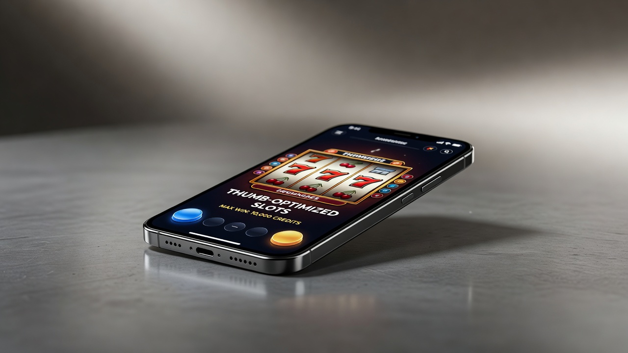
I design casinos. Or I did, for twenty-five years. Now I watch casinos move into phones. It's fascinating because mobile slots have constraints that physical slots don't. You can't make a screen twenty feet tall. You can't rely on floor traffic patterns. You work with the phone's actual affordances.
The best slots on smartphone aren't the prettiest. They're the ones that understand how a human actually holds and operates a device for extended play.
Portrait vs Landscape: The Primary Decision
Most slot games default to landscape because it gives you a wider payline display. But landscape is terrible for phone slots. You have to hold the phone wide, your thumbs are far from buttons, and you're fighting the phone's natural orientation.
Portrait slots are rarer. They require smart column design. Narrower paylines. Vertical scrolling. But portrait is how people hold phones. It's lower cognitive load. Your thumb naturally hits the spin button at screen bottom. The layout feels inevitable.
EVO games and a few Pragmatic Play titles understand this. They build portrait-native slots. Everything is where your hand already is. No reaching, no rotating, no awkward angles.
The Thumb Zone Problem
When you hold a phone, the reachable area for your thumb is roughly the bottom 40% of the screen. Good mobile slots put the spin button there. Reels occupy the upper portion (thumb-optional). Bet buttons on the bottom.
Bad mobile slots put buttons everywhere. You're reaching up to adjust bet size, down to spin, across to settings. That's exhausting. After 30 minutes your hand hurts. You quit. That's bad for the casino.
Professional mobile slots are engineered for the thumb zone. Spin. Bet up. Bet down. Those three buttons are all within comfortable thumb reach.
Screen Real Estate: The Density Problem
A desktop slot can have seventeen paylines displayed. You can see the whole game state instantly. A phone screen is 6 inches across. Displaying seventeen paylines means text so small you can't read it.
The best mobile slots reduce visual complexity. They consolidate information. Instead of listing every payline, they show: "Total Bet: $0.50. Your Win: $0." Clean, readable, glanceable.
Pragmatic Play's newer slots do this well. Microgaming's do it less well. You're staring at a screen, trying to parse data that's been compressed into five-point font.
Animation and Battery Life
Desktop slots run all-day animation. Spinning reels, particle effects, background movement. Phones have limited battery. A slot with constant animation drains your battery in two hours.
Good mobile slots have smart animation. The reel spinning is smooth (uses GPU). The background is static. Win animations are quick and efficient. The game runs cool enough that your phone doesn't throttle.
Bad mobile slots are gorgeous on a desktop and terrible on a phone. They stutter. The phone heats up. You switch apps because the experience is degraded.
The Gyroscope Question
Some mobile slots use the phone's gyroscope. You tilt the phone to spin, or you do a gesture. This sounds innovative. In practice, it's gimmicky. After the novelty wears off, you want a button. Tilting a phone for 200 spins is tedious.
The best slots ignore the gyroscope. They're button-based. Simple. No surprises. Thousands of taps, not thousands of tilts.
Sound Design and Push
Mobile slots can't blast audio. Your phone is quiet or vibration-only when you're in public. Good mobile slots have a sensitivity slider. They default quiet. They offer haptic feedback (buzz) as a substitute for sound.
Win sounds on mobile should be subtle. A little chime, a haptic pulse. Not the full orchestral swell from a desktop slot. You're not at a machine. You're at a bus stop. The sound design reflects that.
Landscape UI on a Phone Screen
Some games (Gold Blox, Aztec Gold) handle landscape well. They use the wider format smartly. Bet buttons on the left, information on the right, reels in the center.
Most landscape slots just stretch the desktop version. The buttons get tiny. The text is unreadable. The reels are weirdly proportioned. It's a bad port.
Loading Time and Latency
A desktop client loads once. A mobile browser has to establish a connection every time you load the game. A good mobile slot loads in under three seconds. Most Pragmatic Play titles do this. Some Evolution games take eight seconds, which feels like an eternity.
Latency is the other problem. A 400ms delay between your tap and the spin starting feels broken. Good mobile slots have under 200ms latency. You tap, it responds immediately. You don't think about the delay because it's not there.
Notch Compatibility
Modern phones have notches. A bad mobile slot gets partially covered by the notch. Text disappears. Buttons vanish. A good mobile slot is notch-aware. It leaves space. The UI adapts.
This is a simple thing. But it shows whether the developer tested on actual phones or just assumed everything would work.
The Best Current Options
Sweet Bonanza (Pragmatic Play) is well-designed for mobile. Simple, portrait-native, fast. Gates of Olympus similar. These are probably the best current mobile slots because they understand the constraints.
EXG games (Evolution) have invested heavily in mobile-first design. Their newer titles are excellent on phone. Not perfect, but solid.
Older NetEnt and Microgaming titles are ports. They work, but they're not designed for mobile. They work better than nothing.
The Future
Mobile slots will get better as developers stop thinking of them as desktop ports. The physics are different. The UX is different. A phone requires a different approach to layout, animation, interaction.
The best mobile slots are the ones that accept those constraints and design within them. Not fighting the phone's form factor, but embracing it. Thumb-native. Portrait-first. Fast. Simple.
That's good design.